Logo design
of Six hockey clubs
in Belarus
Three of them are the most popular
hockey clubs in the country
CREATOR OF EMBLEMS. SPORTS DESIGN STUDIO QUBERTEN, SPRING—SUMMER 2019
Within half a year a lot of work was done and the emblems of many Belarusian clubs were changed including the main club of the country — Dinamo Minsk. The redesign radically improved the outdated emblems, made them relevant, modern, and adapted to the digital world.
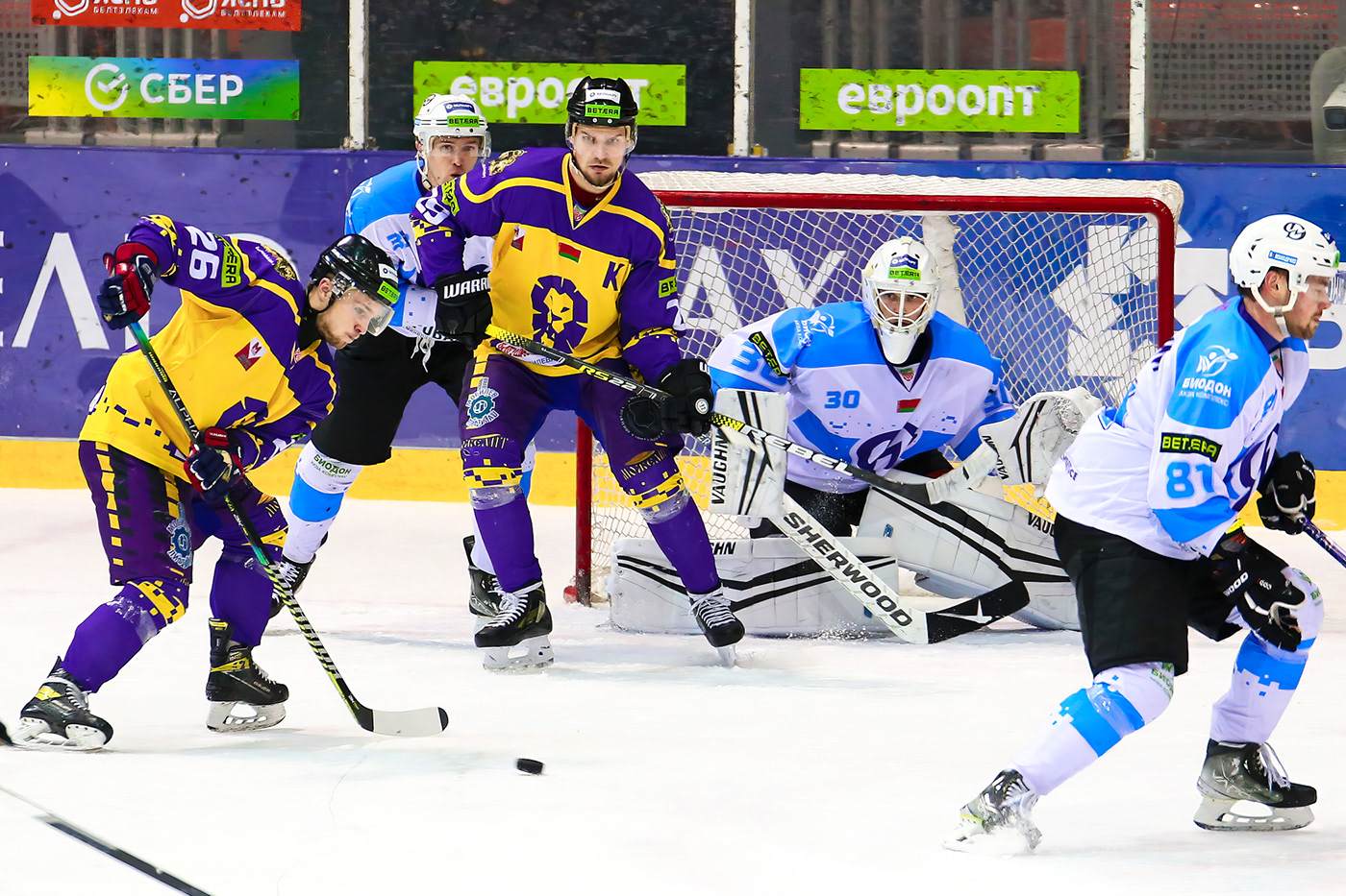
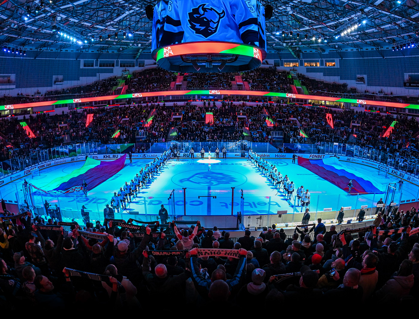
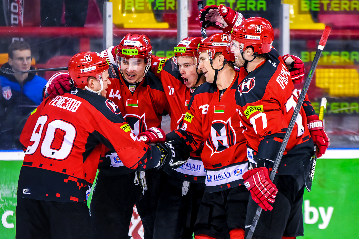
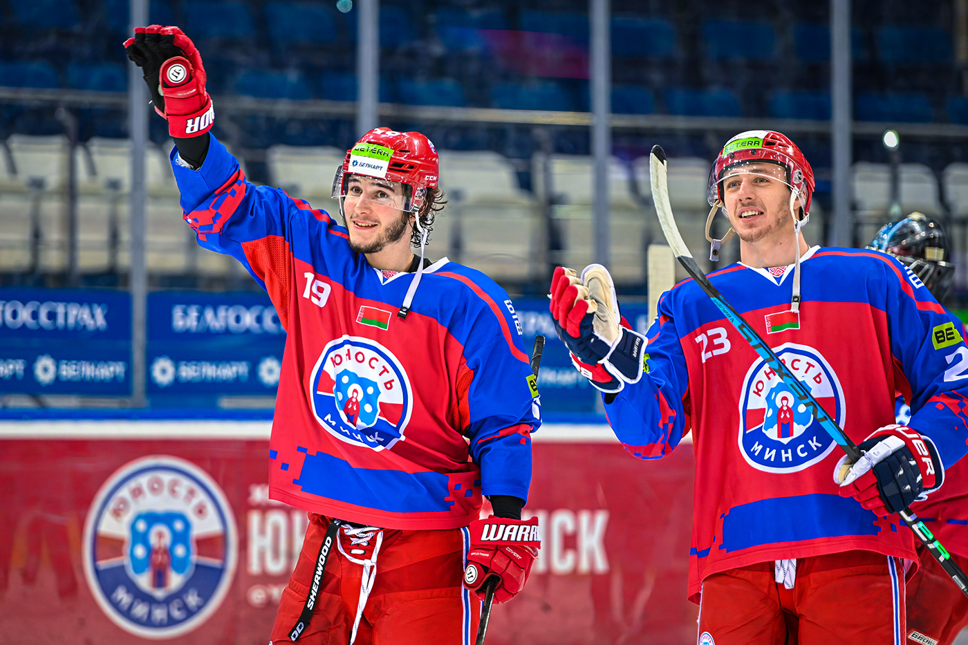
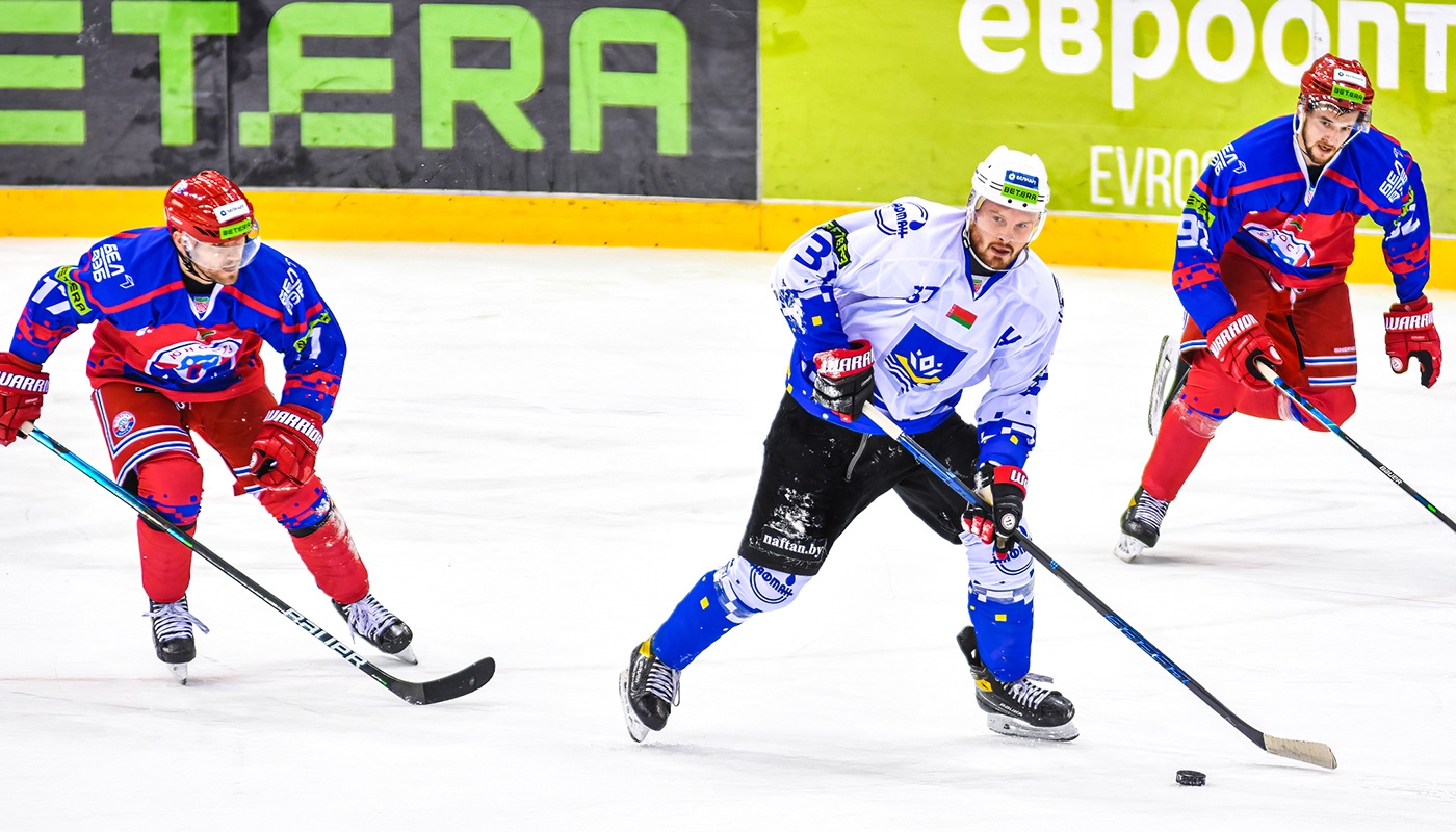
Photo: press services of HC Dinamo Minsk, НС Neman Grodno, HC Yunost Minsk, HC Dinamo Molodechno, HC Khimik Novopolotsk, HC Mogilev. Denis Kostyuchenko/NOC of Belarus, Evgeniya Gurskaya, Artem Ovsyannikov
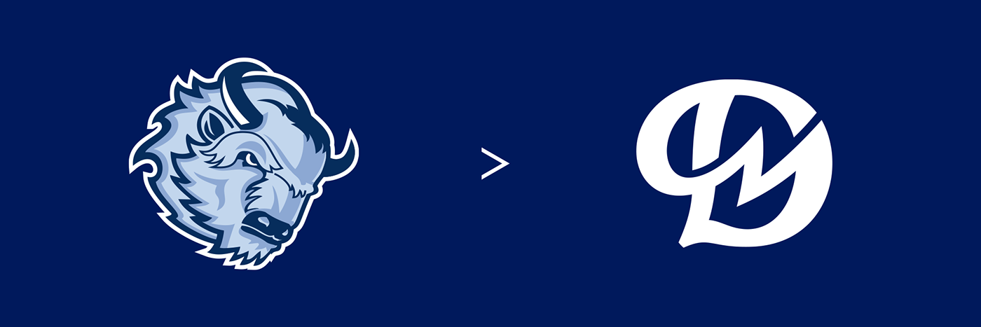
Dinamo Minsk
The club was founded in 1948. Played in the championship of Belarus, won a full set of awards in the country. The best Belarusian club represents the country in the KHL.
The main symbol of the Dinamo Minsk, the bison, has been redone. It has become more charismatic: chopped lines, the slope of the logo and the brutal geometry brought this effect. For the most avid fans, there’s a hidden Easter egg: the letter M is encrypted in the bison's fur, which strengthens the geographical reference.


Neman Grodno
The club was founded in 1988. It has been playing in the Belarusian Extraleague since the first season. Seven-time ice hockey champion (1998, 1999, 2001, 2013, 2014, 2017, 2018), multiple silver and bronze medalist of Belarusian championship, winner of the 2015 IIHF Continental Cup.
The logo of Neman has become cleaner, fresher and more geometric. It meets the modern standards and requirements of digitalization — the logo is adapted for work on a small scale.


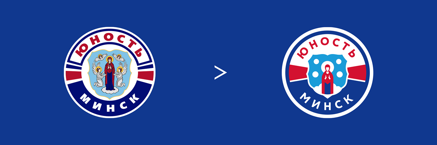
Yunost Minsk
Yunost is the most titled hockey club in Belarus. Club has been champion of Belarus 10 times, most recently in the 2020/2021 season. Three-time winner of the IIHF Continental Cup (2007, 2011 and 2018), six-time winner of the Belarusian Cup named after Ruslan Salei (2004, 2009, 2010, 2013, 2015, 2019).
The logo of Yunost is a special case; I worked with the faces of the saints. It was important to maintain the mood and the meaning of the logo. As a result, it has become cleaner, fresher and more geometric. The logo meets modern standards and requirements.


DINAMO MOLODECHNO
Dinamo Molodechno was founded in 2014. The club performs in the Belarusian Extraliga and is a farm-club of Dinamo Minsk.
The logo of Dinamo Molodechno is a monogram from the letters D and M. The logo contains explicit references to the classic letter D, but at the same time it is a completely new sign that is not the property of the Dinamo society.

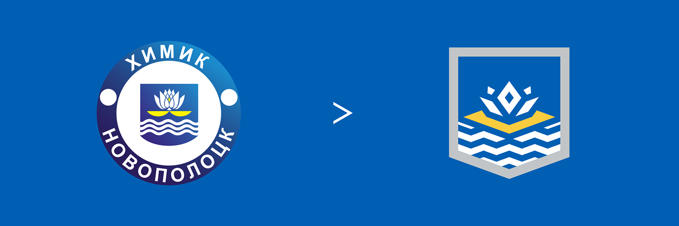
Khimik Novopolotsk
Two-time champion of Belarus, participant of the Federation Cup in 1996, semifinalist of the European Cup in 1996.
The simplification principle requires removing the extra stroke. The emblem of the city has undergone a geometric rethinking.
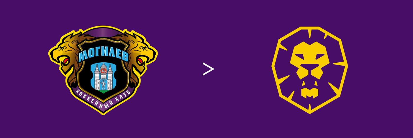
Mogilev
HС Mogilev was formed in 2000 and joined the Belarusian Extraleague in the 2000/01 season.
The city emblem, the inscription, the castle, the second figure gave way to a more convincing image of a lion. The logo retained the color palette of the old emblem. In the lower jaw of the lion has a hidden secret — the letter M.